The (Fashion) World goes Op?

For his final Fall/Winter 2015 collection at Pucci’s, Peter Dundas has been inspired by astrological signs. Among the 61 outfits, 3 graphical black and white silhouettes have caught my attention.

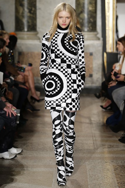
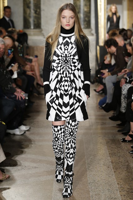
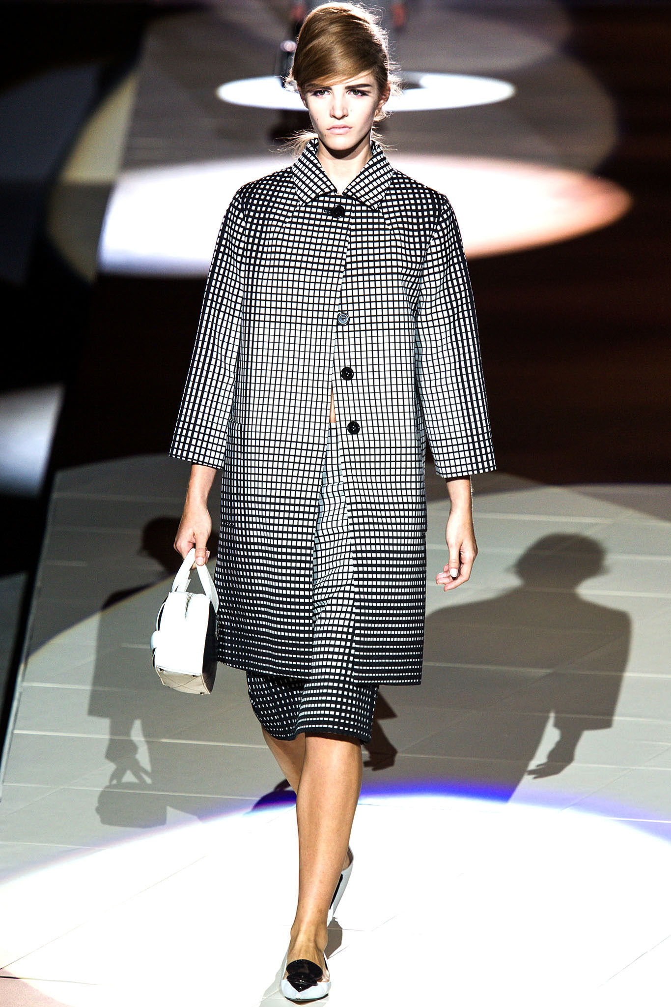
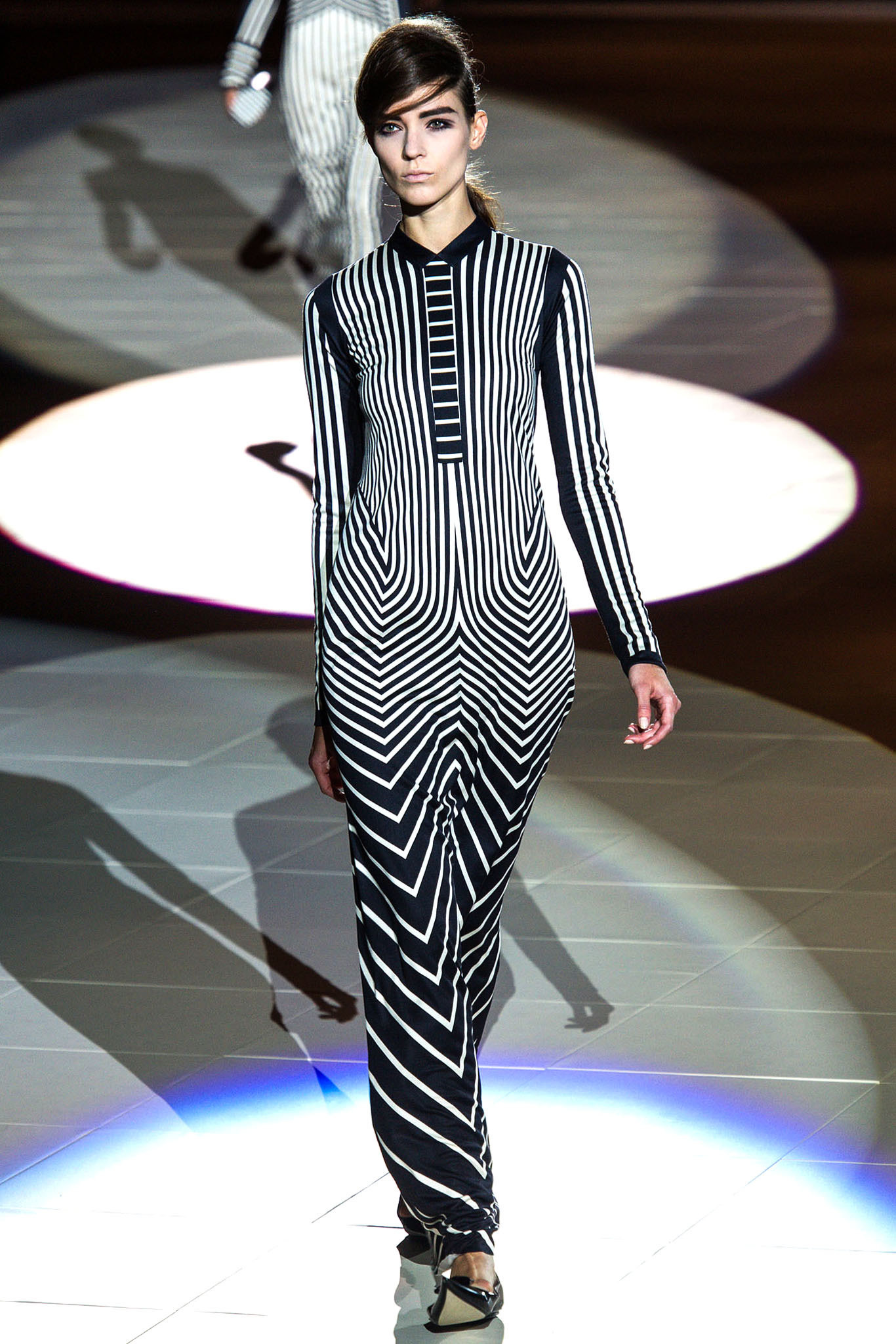
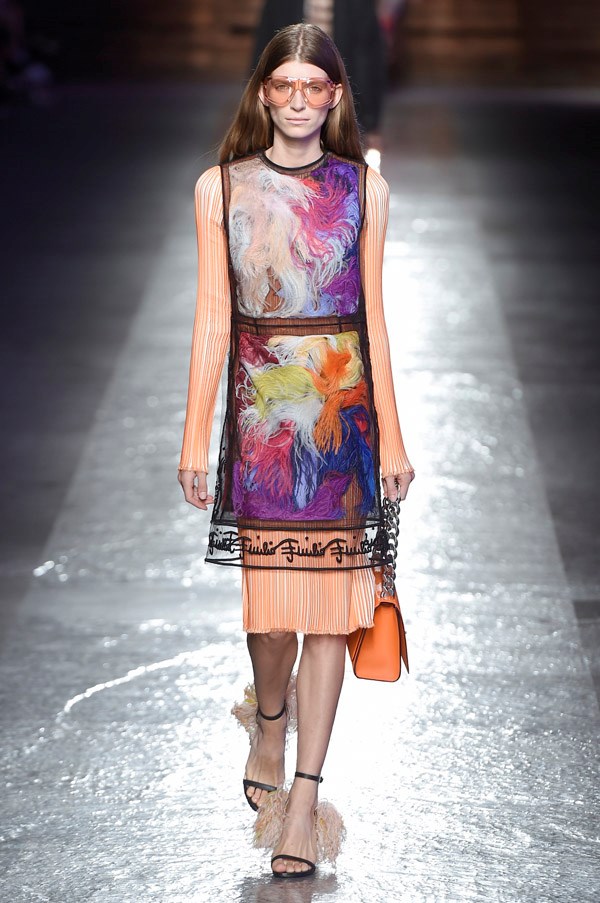
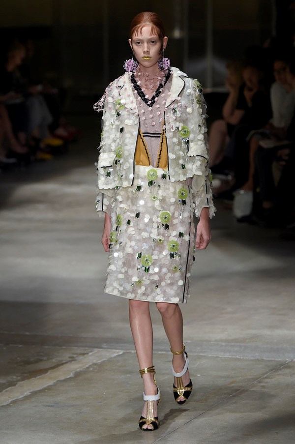
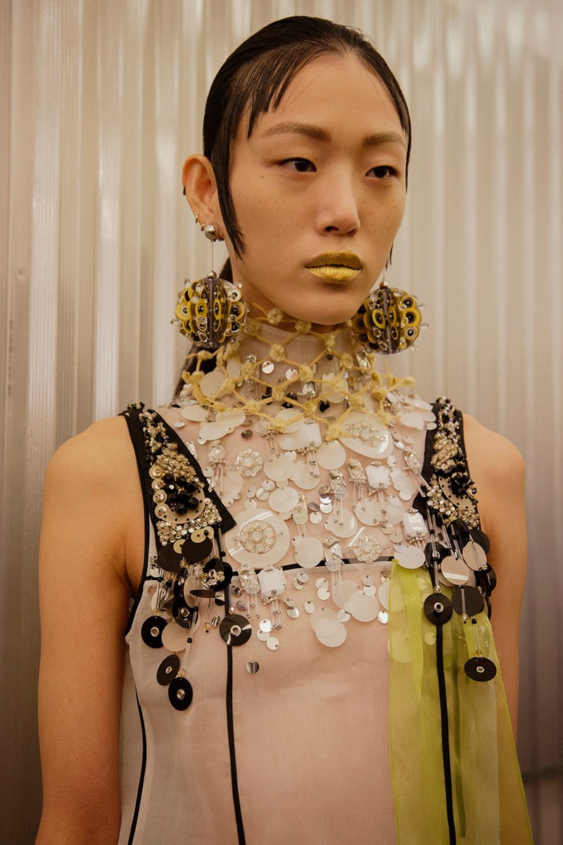
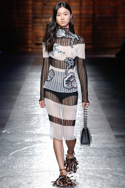
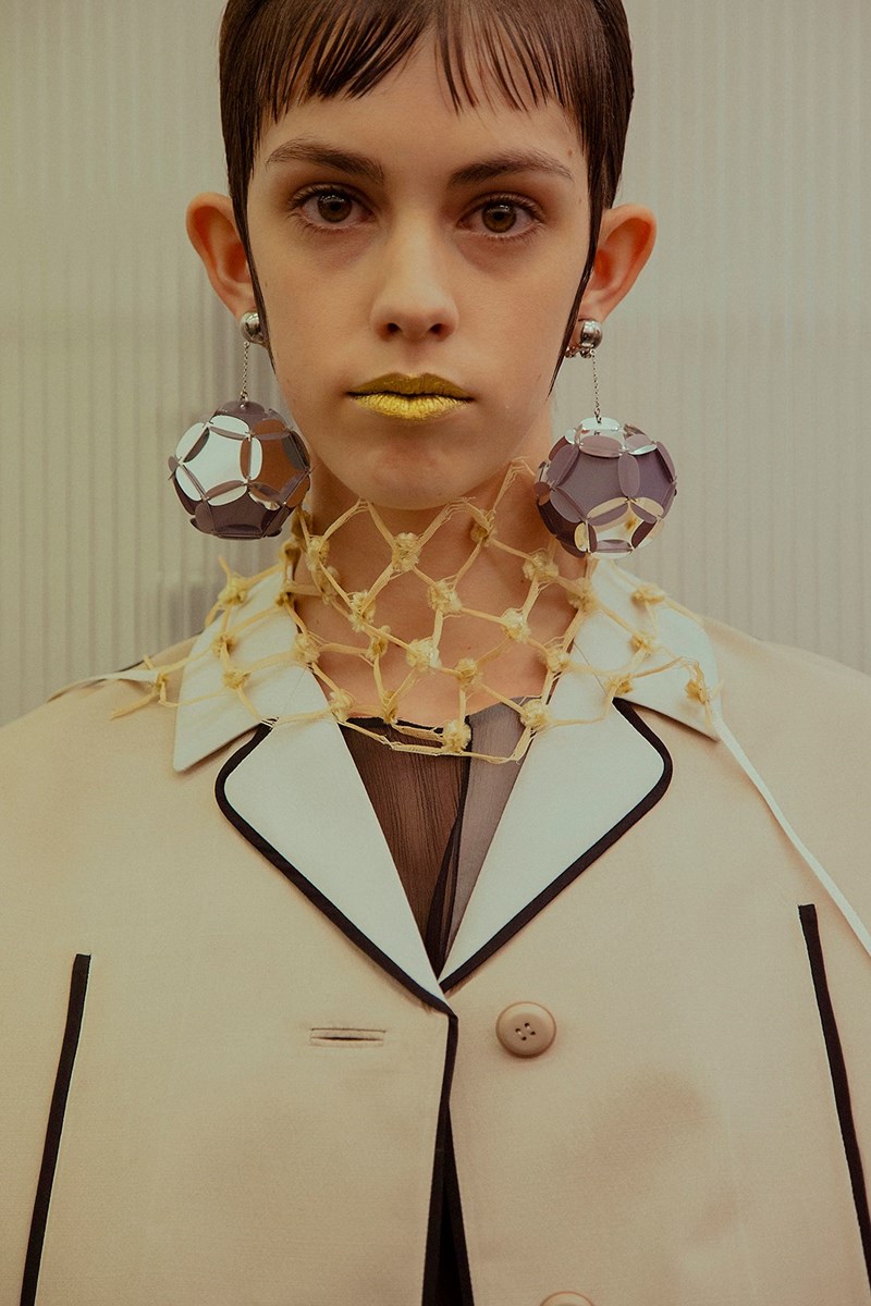
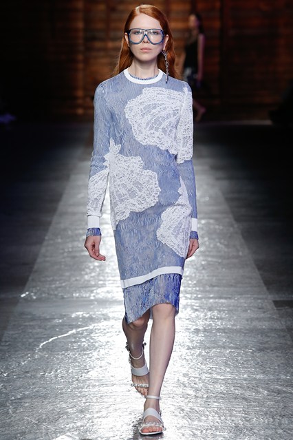
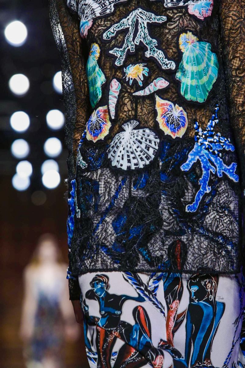
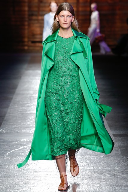
Picture 1,2,3: silhouettes from the Zodiac Collection, Pucci, Fall/Winter 2015.


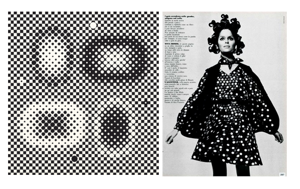
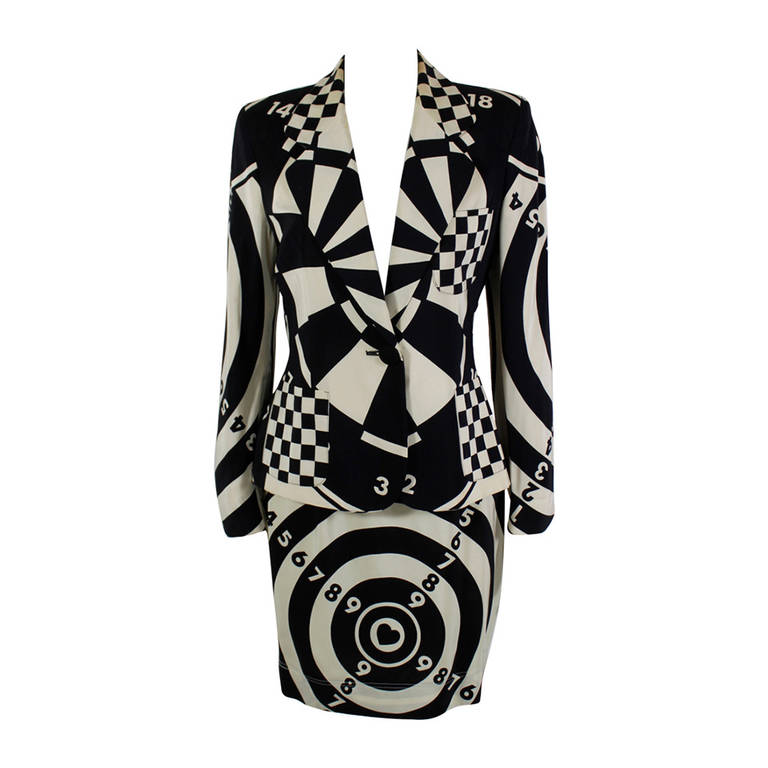
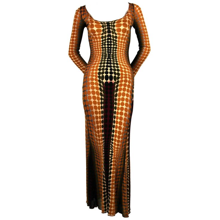
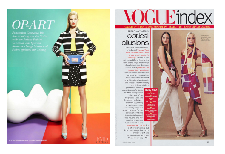
They are directly influenced by Op Art (Optical Art), a form of abstract art based on optical illusions; mostly in black and white but also in primary colours. Geometric black and white patterns create the feeling of a warping movement and fool the eye of a viewer. 


Op art & Fashion in the sixties


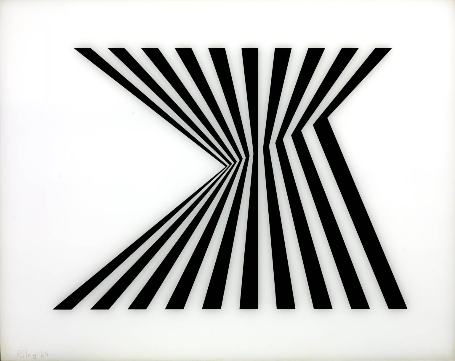
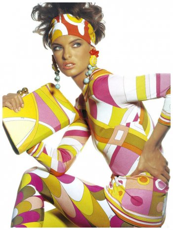
Led by Bridget Riley and Victor Vasarely, it had a considerable impact in the sixties, a decade of social and economical changes marked by the beginning of mass consumption. It completely fitted to the hallucinogenic mood of the sixties and the space conquest aesthetic. 

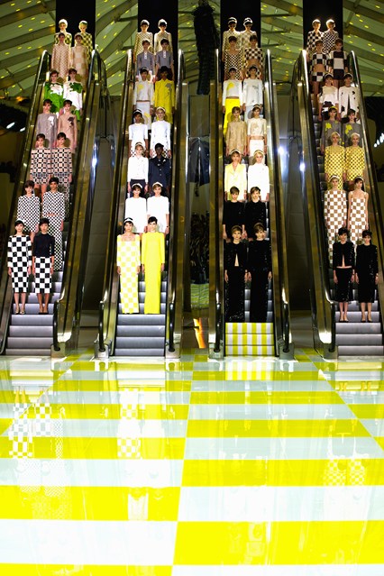
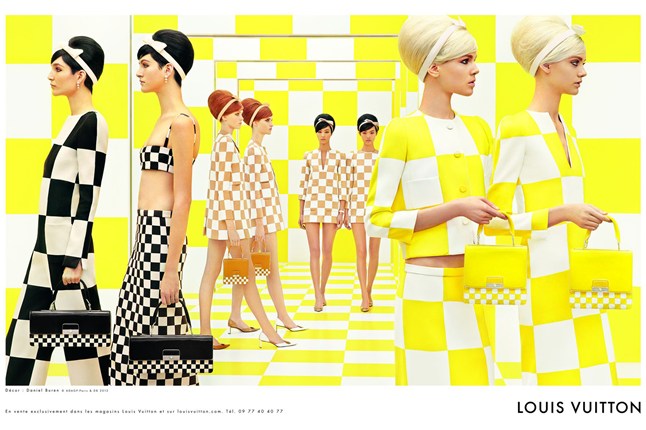
The pinnacle of the movement’s success appeared in the mid-sixties. The term of Optical Art has been coined for the first time in 1964 in a Time Magazine article. It then achieved public recognition in 1965 with “The Responsive Eye” exhibition featured at the MOMA in New York, where 99 artists presented their work. As a consequence, Op Art went global. It began appearing in print graphics, fashion design, interior decoration. Fashion designers took their inspiration from Op and Pop art (two different movements) and experimented with abstract patterns (chequerboard, stripes, dots).

Op Art had an unprecedented commercial success which may have lead to its decline. It had faded by the end of the sixties. Its adoption by a mass market (“trickle across theory”) has been made possible through the development of media and ready-to-wear collections.


Picture 4: "Metagalaxy", Victor Vasarely, 1959-1961. Picture 5 : Tita Rossi dress shot by David Bailey, Vogue Italy, 1969. 
Picture 6: Pierre Cardin collection, 1969. Picture 7: "Fragment 1/7", Bridget Riley, 1964.


Picture 8: "Movement in squares", Bridget Riley, 1961. Picture 9: André Courrèges dress, 1965.


Picture 10: Chrissie Shrimpton & Ossie Clark shot by David Bailey, 1965. Picture 11: "Fragment 3/11", Bridget Riley, 1965.


Op Art & Fashion in the 21st century


Nowadays, it remains a dominant theme in fashion. Fashion designers, magazines, stylists frequently look to Op Art and bring back the movement into the fashion world. 

It’s still a relevant inspiration source in the 21st century fashion.

Picture 12 : Op Art print shirt, Istante,1980’s. Picture 13: Op Art ensemble, Moschino, 1990’s. Picture 14: Op Art cyber print dress, Jean Paul Gaultier, 1995.


Designers can completely embrace the Op Art trend or mix it with other influences. 

In one of his last performances, “Horn of Plenty”, Alexander Mc Queen showcased impressive silhouettes with Haute-Couture inspired evening gowns. His influences for this Fall/Winter 2009 collection were large: The Australian artist Leigh Bowery, My Fair Lady or the energy of the London club scene from the nineties. Vertical and horizontal stripes created an Op Art style pattern and accentuated the dramatic effect of the collection.

Picture 15,16: silhouettes from the Fall/Winter 2009 collection, Alexander McQueen.


More recently, Marc Jacobs explored optical effects with bi-colour outfits in his Spring/Summer 2013 collection. Geometric elements were everywhere and the homage to Bridget Riley and the sixties was clear. Behind the visual impact of these silhouettes, he played with the body architecture and reinterpreted Op Art with a modern tailoring. 


Picture 17, 18, 19, 20: Marc Jacobs Spring/Summer 2013 collection.


In parallel, he partnered with the artist Daniel Buren for Louis Vuitton. The artist set the show with giant escalators and checkerboard runways. His work illustrates the synergy between Art and Fashion. Art inspires designers and is also part of a larger collaboration (scenography, campaign).

Picture 21: "mise en scene" & scenography by Daniel Buren, Spring/Summer 2013 show. Picture 22: Vuitton Spring/Summer 2013 campaign.


Op Art is visually appealing and suits to the “Insta Age”. According to Albert Elbaz, the Lanvin creative director: “Everything is for the photo. So we created a collection that is for the photos (4).” 

Magazines and high-street brands are the next gatekeepers to translate Op Art into fashion editorials, graphic contents, and affordable collections

Picture 23: Vogue Italia, November 2000, photography by James Moore. Picture 24: W Magazine editorial, January 2013, photography by Roe Ethridge, style by Giovanna Battaglia.
 
Picture 25: Elle Germany editorial, may 2011. Picture 26: Vogue Index, Optical Allusions, Vogue US, photography by Katarina Tsatsanis, style by Isabel Arnhold.
   
Picture 27, 28: online editorial, Schon Magazine, 2015, photography by JUCO & style by JAK.
Capture d’écran 2015-10-26 à 17.02.52.png
Picture 29: 2 looks from the Spring/Summer 2013 Vuitton collection. Picture 30: 2 looks from the Spring/Summer 2013 Zara collection.
Signature blog.jpeg
 

(4) Chabbott, Sophia, Lanvin designer talks personal style in the age of Instagram (Glamour US, 2015)

Go Big or Go Home!

There’s definitely something in the air in Milan as the last Fashion Week demonstrated it. Milan is bubbling: the universal exhibition, the recent arrival of Carlo Capasa at the Italian Chamber of Fashion, the appointments of Alessandro Michele at Gucci’s or Massimo Giorgetti at Pucci’s. Italy has also a new Prime Minister – Matteo Renzi- since 2014, after years of scandals with Silvio Berlusconi. Two words: “eccentric maximalism”. Runways have embraced elaborate prints, extravagant embellishments, unexpected combinations of textures and colours

We can shortly define the minimalist trend as the simplification of a shape, a strong tendency in the nineties where some designers were reacting against the excesses of the eighties. Does it mean that the eighties are back? After “Less is more”, is it time for “More is More”?

Italian fashion is renowned for the quality of its techniques and materials. This season, many Italian designers have explored a new definition of “Made in Italy”. They have broken the rules and played with complex patterns, textures and details. Despite their different signature styles and histories, a general trend has emerged from Italian catwalks, as WGSN or established fashion magazines such as Vogue spotted it in their last analyses. It’s not brand new. Nothing is new in fashion but it has been escalating for some years, in Milan and other fashion capitals. Even Phoebe Philo, the goddess of minimal chic, has proposed graffiti prints and pieces inspired by Brassaï in her Spring/Summer 2014 collection for Céline.


Pictures 1 & 2: Brassaï & Parisian street art inspired collection, SS2014 Céline.


Maximalist fabrications

Texture & 3D effects

Texture plays an important role. Designers have experimented with three-dimensional effects. Silhouettes attract attention with handcrafted techniques and embroideries. This quirky design can be created by using sequins and over-sized sequins, lace, feathers, fringed and looped surfaces, pleated effect, beading. 

Pictures 3,4,5: Pucci, Prada, Dolce & Gabbana fashion shows. Pictures 6,7,8: details of textures.

Over-sized sequins & sequins

BP2_Pic7_AJLJ.jpg
Pictures 9,10,11: Marni, Prada, Au Jour le Jou.
sequins_pucci.jpg
Pictures 12,13,14: Pucci, Lanvin, Loewe.

Fabrics

Jacquard & shiny fabrics

Baroque fabrics (shiny jacquard) with sophisticated patterns inspired by interior decoration will complete this maximalist aesthetic. Fabrics can also be highlighted with silver and gold metallics.

 
détails_Gucci.jpg
 
Pictures 15,16,17: Dries Van Noten, Marco de Vicenzo, Gucci. Pictures 18, 19: Rochas,Prada.

Sheer effect

Sheer overlay and transparencies are also a big part of these showy silhouettes. They are not treated in a “romantic” way but bring an edgy element to outfits. 

Pictures 20, 21, 22: Pucci, Versace, Dolce & Gabbana.
 
 
Pictures 23 & 24: Stella McCartney, SACAI.

Bold colours

Original combinations of colours have been seen on the SS16 catwalks. Prada is well known for its “ugly chic” approach so you won’t be surprised. The pictures speak for themselves:) Brands have mostly adopted bright colours (yellow, green, red, pink) accentuated with a gold or silver touch.

KOOKY STYLING

The “more is more” attitude implies massive accessories (XL earrings/glasses/jewellery) to finish this theatrical looks. 

Pictures 25, 26, 27: Loewe, Gucci, Prada.


In terms of democratisation, how this trend might evolve? We know that high streets brands are directly inspired by catwalks. Minimalism is easy to copy for them. How will they respond to this appealing aesthetic? Nowadays, only a few luxury brands have the resources to employ embroiders. Embellishments are pricey. Will this trend trickle down? Is it gonna be easily wearable every day? I doubt that the “average” consumer will wear these eccentric pieces from head to toes. “Eccentric Maximalism” is more about details. Picking one statement piece rather than wearing the complete look. It perfectly fits with the today's zeitgeist where Instagram plays a strategic role in brands communications. This style stands out and grab the attention more than minimalist collections that’s why it might have a strong resonance for the next seasons.


(2) Title inspired by an article from Vogue US. Okwodu, Janelle, On the runway, Sunglasses Go Big or Go Home(Vogue US, 2015).

(3) Concept developed by MSGN in its last SS16 analysis. 

Source: http://www.gucci.com/uk/home

Urban Mermaids...

For his first collection, Massimo Giorgetti, the new creative director of Emilio Pucci and founder of MSGM, proposed a different vision of the Pucci’s heritage. As Tim Blanks suggested it, last September, in The Business of Fashion, “there wasn’t much that said Pucci”(1). Instead of using predictable Pucci’s codes, the freshly appointed designer chose another direction. 

Emilio Pucci is well known for his colourful and swirling prints. In fashion history, his work is deeply connected to the sixties, the Golden Age of this iconic label. His most famous prints are associated to the psychedelic and hippie aesthetic, the pop culture. It’s actually a misconception about the brand to consider that the prints he made have always been abstract. Initially, his work was dominated by figurative patterns and influenced by everything around him: his Italian roots, the architecture, the Palazzo Pucci (the place were he used to live and work), his travels in Asia or Africa. 

 
BP1_Pucci_Pic1.jpeg
BP1_Pucci_Pic2.jpg
 

Picture 1: Emilio Pucci shot in Life Magazine (1960). Picture 2: Iconic print, Linda Evangelista shot by Irving Penn, Vogue US (1990).


There’s definitely much more to say about the Pucci’s legacy. This is what the Italian fashion house intended to do with this Spring/Summer 2016 collection.

A nautical spirit


Back to basics with this nautical collection! Seascapes are a recurring theme in the brand history. Emilio Pucci was one of the first designers of his time to design beachwear and summer collections. He opened his first store on Capri’s island in 1949, a resort for intellectuals, artists and aristocrats. He had this idea that dressing should be easy. Clothing were not particularly liberating for women during this Post-war period and he was the first one to design fun, practical and sporty clothes for jet-setters. Massimo Giorgetti kept this nautical spirit with different shades of blue, figurative drawings (colourful fishes, sea shells) and striped dresses and tops:

  
Pictures 3,4,5: silhouettes inspired by the sea. 


He has drawn his inspiration from early fifties and sixties prints:

  
96


Normal
0


21


false
false
false

FR
JA
X-NONE


 <w:LatentStyles DefLockedState="false" DefUnhideWhenUsed="false"
DefSemiHidden="false" DefQFormat="false" DefPriority="99"
LatentStyleCount=…
&nbsp;&nbsp; 
Picture 6: "Gaviota IV" special edition scarf, no date. Picture 7: "Gioielli del Mare"scarf, 1950. Picture 8: "Pesci" scarf, 1969.


These sleek (split skirts, wide-leg trousers) and sporty silhouettes (sweaters, bomber jackets) are balanced by rich embroideries (sequins, lace, patterns). It brings a “couture” aspect as well as a glamourous twist (sequins) to the whole collection. 

Pictures 9,10, 11: laid-back & sporty silhouettes, Pictures 12,13,14: rich embellishments. 


Pictures 14 bis & 14 ter: embroideries details.


Splashes of colours and vivid silhouettes appear as a watermark on a few outfits: a subtle way to refer to the brand’s symbols

Pictures 15, 16, 17: bright silhouettes. 


During the MFW, Massimo Giorgetti insisted on the modernity of the collection. It’s about “NOW”, the present time, not the past. Futuristic accessories such as big glasses (googles) and fluffy sandals are a reminder of this idea along with the music of the show (The Strokes).

Pictures 18, 19, 19 bis: some kooky accessories from the show. 

The Pucci’s signature 


It has contributed a lot to shape the Pucci’s identity. Some pieces of the collection have indeed the word “Emilio” written in cursive. In the fifties, Emilio Pucci has been one of the first designers to acquire a recognizable high status label and a signature style. Pucci were copied a lot and the authenticity of a Pucci garment could only be verified when the signature “Emilio” was on the print. 

Picture 20: the Pucci's signature. Pictures 21, 22: silhouettes from the show with the new Pucci's signature. 


Being part of the Italian aristocracy, the Pucci family emblem is a Moor’s head. It appears in a more modern way (branding) on some relaxed pieces of the collection.


Picture 23: The emblem of the Pucci family. Picture 24: The Pucci monogram. 


(1) Blanks, Tim, Emilio Pucci wants to sign your spine (The Business of Fashion, 2015).

Source: http://home.emiliopucci.com/collections/sp...